Today we want to talk about jut how to make mobile-friendly websites. This is a follow-up to our previous blog post, Mobile Friendly Websites Part 1: Are Your Clients Websites Mobile Friendly and Why Does It Matter?
Your clients’ customers should easily be able to use their websites whether from a smartphone, a tablet, a laptop or a desktop. Because mobile devices have much smaller screens than laptops or desktops, it’s necessary to change how the content is presented. For example, a desktop version might display a complete menu where the mobile version might display three lines (hamburger menu) you have to click to see all the choices.
The mobile version may require the user to scroll down to see come content that is easily viewable on one screen on the desktop version of the site. But all versions need to enable the user to easily navigate the site and easily find information.
Determine How to Adjust Size
To make mobile-friendly websites, you must know how to adjust the display according to the size of the screen. It doesn’t work to just crunch up a site that works on a desktop into the small space of a phone. There are three possible solutions for this. Google does not give preference to one over the other for ranking.
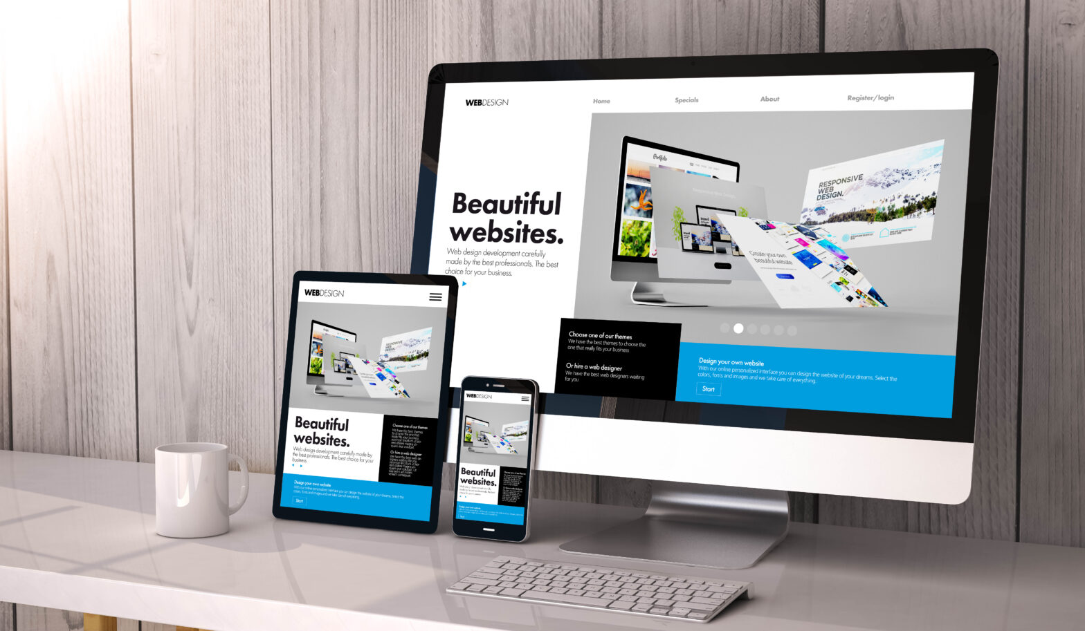
Responsive Web Design: Recommended by Google
Responsive web design automatically adapts content to the size of the screen. This method is recommended by Google because it is both the easiest method to develop and maintain.
For all devices, it uses
- The same HTML code
- The same URL
The rest of this article will assume that is what you are using, but we do want to also address your other options.
Check out this page on Responsive Web Design Basics.
Dynamic Serving
Dynamic serving will serve the correct version of HTML to each device so content appears readable despite screen size. The URL remains the same. However Google specifically recommends that responsive web design is superior to dynamic serving.
Separate URLs
Separate URLs means separate sites are designed for each size. It will redirect to the site designed for each type of device. The desktop and mobile devices will have different URLs.
This is hard to implement and hard to maintain. Therefore, Google recommends against it.
Take Google’s Mobile-Friendly Test
Before you can fix a website, you need to know what’s broken. Fortunately, Google has a helpful, free tool to test web pages and thereby help you make mobile-friendly websites. To use the Mobile-Friendly Test, simply enter the URL of the page into the bar you can see as soon as you open the page.
Result possibilities are
- Page is usable on mobile: This means the page will work well on a mobile device. However, it could still have a small number of minor issues.
- Page isn’t usable on mobile
- URL is not available to Google: Google is unable to crawl and index the page, so it cannot test for mobile-friendliness.
- No data available: Google could not retrieve the page and therefore could not test the page. This may be temporary. Try again a little later.
If the page is not mobile-friendly, the test will point you to what you need to fix in responsive web design such as
- Uses incompatible plugins: This means the page is using plugins not supported by most mobile browsers. To fix this, Google recommends redesigning the page with more up-to-date, broadly supported technology such as HTML5.
- Viewport not set: This means does the page does not tell browsers how to adjust the page’s dimensions to the screen size. Check out Google’s page Responsive Web Design Basics for information about how to fix this by setting the viewport.
- Viewport not set to “device-width”: The page defines a fixed width viewport, so it cannot adjust to varying screen sizes of different devices. To fix, see the same page recommended above for when the viewport is not set.
- Content wider than screen: When the content is wider than the screen, that means that the reader must perform annoying horizontal scrolling to see all the content from left to right. To fix it, the page must be adjusted so it uses relative width and position values for CSS elements Images must also scale. Find out more about this problem and how to fix it.
- Text is too small to read: To fix this you need to set your viewport so font sizes scale according to the screen size of the device. Check out this page about font size best practices.
- Clickable elements too close together: This means that items the user wants to click are so close together they may often click the wrong item. See Accessible Tap Targets for more information.
You can monitor user friendliness of an entire site on Google Search Console, but you will need to verify ownership of the site. Search Console also alerts you to other important site errors such as hacked content and gives you help in managing how content appears in search results.
Check Your Links
As time goes by, some content your client’s site links to may be removed creating a dead link. Sometimes there is a link error because the link was bad to begin with. Whatever the cause, a site with a lot of broken links is not user friendly or mobile friendly. It’s frustrating to users when they are sent to an error page.
Google penalizes for this. Also, Google cannot crawl pages you link to that do not exist. So broken links will negatively affect your client’s search rankings.
Rid Your Client’s Site of Annoying Pop-Up Banners
Pop-up banners that cover the page’s content trying to push users to products and services irritate users to no-end. Google refers to these as “intrusive interstitials.” These interstitials annoy users, because they prevent users from accessing the content they expected. In other words, intrusive interstitials contribute to a much poorer user experience, something Google wants to avoid. If your client’s site is using these, get rid of them, because Google penalizes for them.
There are a few exceptions Google is okay with however. These include interstitials in response to a legal obligation. An example might be one about cookie use. Google also does not have a problem with banners that don’t use a lot of screen space and can be easily closed. An example is the app install banners of Safari and Chrome.
Contact Umbrella for Help to Make Mobile-Friendly Websites
The ability to make mobile-friendly websites is vital to your clients’ success. This is a starting place for digital marketing.
If web design is not your agency’s focus, Umbrella has experts who can make mobile-friendly websites through white label website development services and white label design services. Contact Umbrella now for a free consultation.
Share This Article
Subscribe to our newsletter
Subscribe to The Marketing Umbrella Podcast
Where we interview leading experts on ways to build and grow your business
Get a FREE copy of this top seller book - BUILDING THE ULTIMATE MARKETING AGENCY
Get the strategies and practical tactics from the world’s leading marketers, to grow your agency without breaking the bank!
